
Climate change projections
Climate change and agriculture are interrelated processes, both of which take place on a global scale. Global warming is projected to have significant impacts on conditions affecting agriculture, including temperature, carbon dioxide, glacial run-off, precipitation and the interaction of these elements (http://en.wikipedia.org/wiki/Climate_change_and_agriculture).
This exercise aims to explore the effects of climate change using a simple wheat cropping system. Firstly, the response of wheat to elevated CO2 is examined. For this simulation a climate control component needs to be included.
In this analysis, you will look at seasonal changes in rainfall, evaporation, transpiration and crop yields.
- Construct a long term wheat simulation at ‘Dinajpur’- use the Rice-wheat simulation in your ‘Rotations.apsim’ file as a guide. (Hint: Make a copy of Rotations .apsim and rename it to Climate change.apsim.) Delete all the simulations except for the Rice-wheat simulation as this will become the template for the following exercises.
- Rename the Rice-wheat simulation to Wheat-350ppm.
- Select a new met file. Use the browse button to select the Dinajpur.met file from c:\APSIM_workshop\met_files\.
- Select clock for editing:
Select the start date: 1/01/1959
Select the end date: 31/12/2009 - Drag a ClimateControl component on to the Wheat-350ppm simulation (from “Standard Toolbox” -> “Meteorological (ClimateControl”).
- Select ClimateControl for editing:
Enter window to START: 1-jan.
Enter window END: 31-dec.
Change in maximum temperature: 0.
Change in minimum temperature: 0.
Relative change in daily rainfall: 0.
Relative change in daily radiation: 0.
Atmospheric CO2 Concentration: 350.
(Hint: you may want to move ‘ClimateControl’ to below the ‘met’ component. Use Ctrl + up arrow) - Remove all the manager logic used for the previous rice simulation. (Hint: Delete Rice-Transplant Aman, Pond_depth, Fertilise on growth stage, Rice residue.)
- Drag a tracker component on to the Manager Folder (from “Standard Toolbox” -> “Management (tracker)”).
- Add the following lines to the tracker component:
Tracker variables sum of rain on start_of_day from sowing to now as RainSinceSowing sum of ep on end_of_day from sowing to now as Transp sum of es on end_of_day from sowing to now as SoilEvap - Choose these variables to report: (under Output node)
Component Variable name Clock dd/mm/yyyy as Date Year Day wheat wheat.yield as wheat_yield wheat.biomass as wheat_biom Soil (Silt) ESW NO3() wheat wheat.yield as wheat_yield wheat.biomass as wheat_biom met rain tracker RainSinceSowing Transp SoilEvap - Change ‘Reporting Frequency’ to harvesting. (Hint: Select question mark to display examples for reporting frequency)
- Delete existing XY charts under the ‘Outputfile’ node.
- Make a linked simulation of ‘Wheat-350ppm’ and rename it to “Wheat-450ppm”. There are several ways to make linked simulations:
a) Right click and hold down on the source simulation and drag it to the top level (simulations) node. A popup menu appears when you let go, select the “Create Link Here” option.
b) Select the source simulation with the left mouse button, hold the keyboards <alt> key down, and drag it to the top level (simulations) node.
The advantage of linked simulations is that changes made to any component are made to all linked components. - Select the linked simulation ‘Wheat-350ppm1’ (in blue) and rename to ‘Wheat-450ppm’.
- Right click on the ClimateControl component and select ‘unlink this node’ from the drop down box. (The blue underlined link will change to black text)
- Select the ClimateControl for editing:
Change Atmospheric CO2 Concentration to 450. - Save and run both simulations. (Hint: select the ‘Simulations’ node at the top and then the run button to run both simulations at once)
- Create a graph comparing wheat yields from each of the simulations . Drag a Probability Exceedence component on to the ‘Simulations node’ (from “Graph” -> Graphs-> “Probability Exceedence”).
- Graph ‘wheat_yield’ (X axis) vs ‘Probability’ (Y axis). Rename the graph to ‘Wheat response under climate change scenario
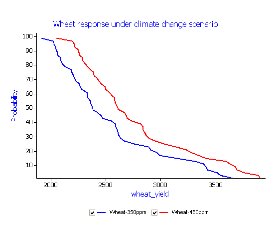
In the above example a ‘Probability of Exceedence’ chart was selected to compare the probability of grain yields under different background concentrations of atmospheric CO2 (350 ppm and 450 ppm) using 50 years of daily climate data from Dinajpur in northern Bangladesh. The graph highlights a yield response by APSIM to an elevated CO2 level of 450 ppm. However, increasing levels of CO2 are only one aspect to be considered in any climate change scenario with the IPCC (2007) predicting significant increases in global temperatures over the next 50 to 100 years.
The next exercise builds on the previous example by creating two additional simulations. The first will consider current levels of CO2 at 350 ppm but with an increase in minimum temperature of 1.5 oC. The second will maintain an increase in minimum temperature in conjunction with an increase in CO2 to 450ppm.
Climate change response to an increase in minimum daily temperature
- Make a linked simulation of Wheat-350ppm and name it Wheat-350ppm+2degC.
- Select ClimateControl for editing and right click and “unlink this node”.
(The ClimateControl will change from underlined blue to black text) - Select ClimateControl for editing: Change in minimum temperature: 2.
- Run this new simulation.
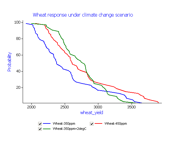 The Wheat response under climate change scenario graph now includes the results of this latest simulation. Create an additional simulation based on ‘Wheat-450ppm’ using the steps above. Rename this new simulation to ‘Wheat-450ppm+2degC’.
 - Run new simulation.Notes:
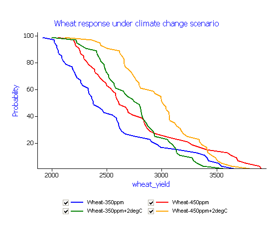 Question: How has increasing minimum temperature affected grain yield in relation to an increase in the level of CO2?
Additional exercise: Explore the effects of increasing maximum temperature under this scenario.
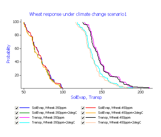
Changes in biomass and grain yield will have a direct effect on transpiration and soil evaporation. Create an additional graph from the ‘Graph’ toolbox or by copying ‘Wheat response under climate change scenario’. Selecting both SoilEvap and Transp on the X axis for graphing.
Notes:
Climate change response to rainfall
In this exercise you will investigate changes to wheat yield in response to modifying rainfall, temperature and CO2 by creating a simple experiment. This simulation experiment requires a control treatment (previous wheat simulation based on a CO2 concentration of 350 ppm) and a number of additional treatments:
(1) Increasing CO2 to 450 ppm
(2) Increasing minimum temperature by 2 oC
(3) Decreasing rainfall by 10%
- Drag a Folder component onto the ‘Simulations’ node (from “Standard Toolbox” -> “Structural (folder)”).
- Rename this folder to Senario.
- Make a copy the Wheat-350ppm simulation by dragging it on the Scenario folder. Rename this simualtion to Control.
- Copy the Wheat-450ppm simualtion to the Scenario folder and rename it to C450 (CO2:450ppm). (Unlink the simulation by right clicking and selecting Unlink this node)
- Create a copy of Wheat-450ppm+2degC. Rename this copy to C450+T2 (CO2:450ppm and minimum temperature + 2 oC).
- Create a copy of C450+T2 by dragging it onto the Scenario node. Rename this simulation to C450+T2-R5 (CO2:450ppm and minimum temperature + 2oC and rainfall -10%).
- Select the ClimateControl node in C450+T2-R10 for editing:
Relative change in daily rainfall: -10. - Run all the simulations in the Scenario folder.
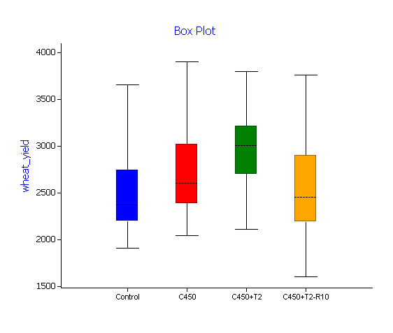
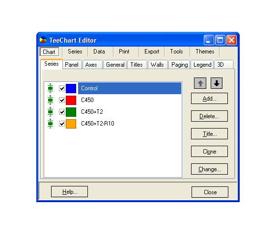
(Hint: Highlight the ‘Scenario’ folder and press “Run” to run all simulations together) - Create a box plot graph showing the results of each treatment. To do this, click on the Graph Toolbox at the bottom of the window to open the toolbox. Then drag a ‘Box Plot’ component (from “Graph” -> “Graphs (Box Plot)”) and drop onto the Scenario node.
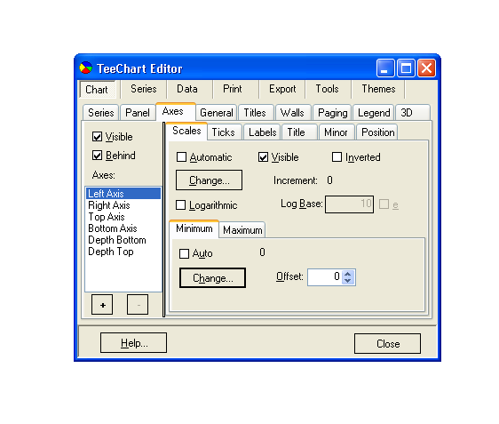
 Hint: To change the Y axis right click on the chart and select Format Graph. Select Axes. For the ‘Left Axis’ untick Minimum and change value to 0. Close ‘TeeChart editor.
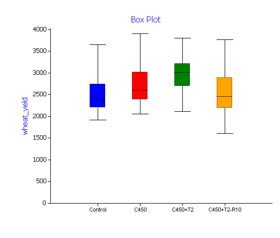
The “box plots” used in the above graph represent median wheat yield (dotted line) in response to applied treatments (based on 50 years of simulation). The solid section (25th and 75th percentiles) with whiskers representing the 10th and 90th percentiles.
Additional exercise: In the above scenario, decreasing rainfall (at CO2 levels of 450ppm) had only a small influence on median wheat yields due to available irrigation. In this example wheat is a dry season (Rabi) crop sown into high levels of soil water at the end of the monsoon with additional irrigation applied during the growing season. Access to available surface or ground water for irrigation under a declining rainfall climate change scenario may present a challenge for future agriculture. What would the effect of reducing the amount of applied irrigation or reducing starting soil moisture have on potential grain yield?